Solara is a mood-regulation app that uses immersive sound and light to create emotional balance. Inspired by nature’s rhythms and sensory healing, it offers guided experiences designed to calm the nervous system and center the mind.

Problem
How do you visually express tranquility—without falling into clichés of wellness? The challenge was to design a brand that feels modern, immersive, and emotionally resonant, while staying clear of sterile minimalism or overused spiritual motifs.
Outcome
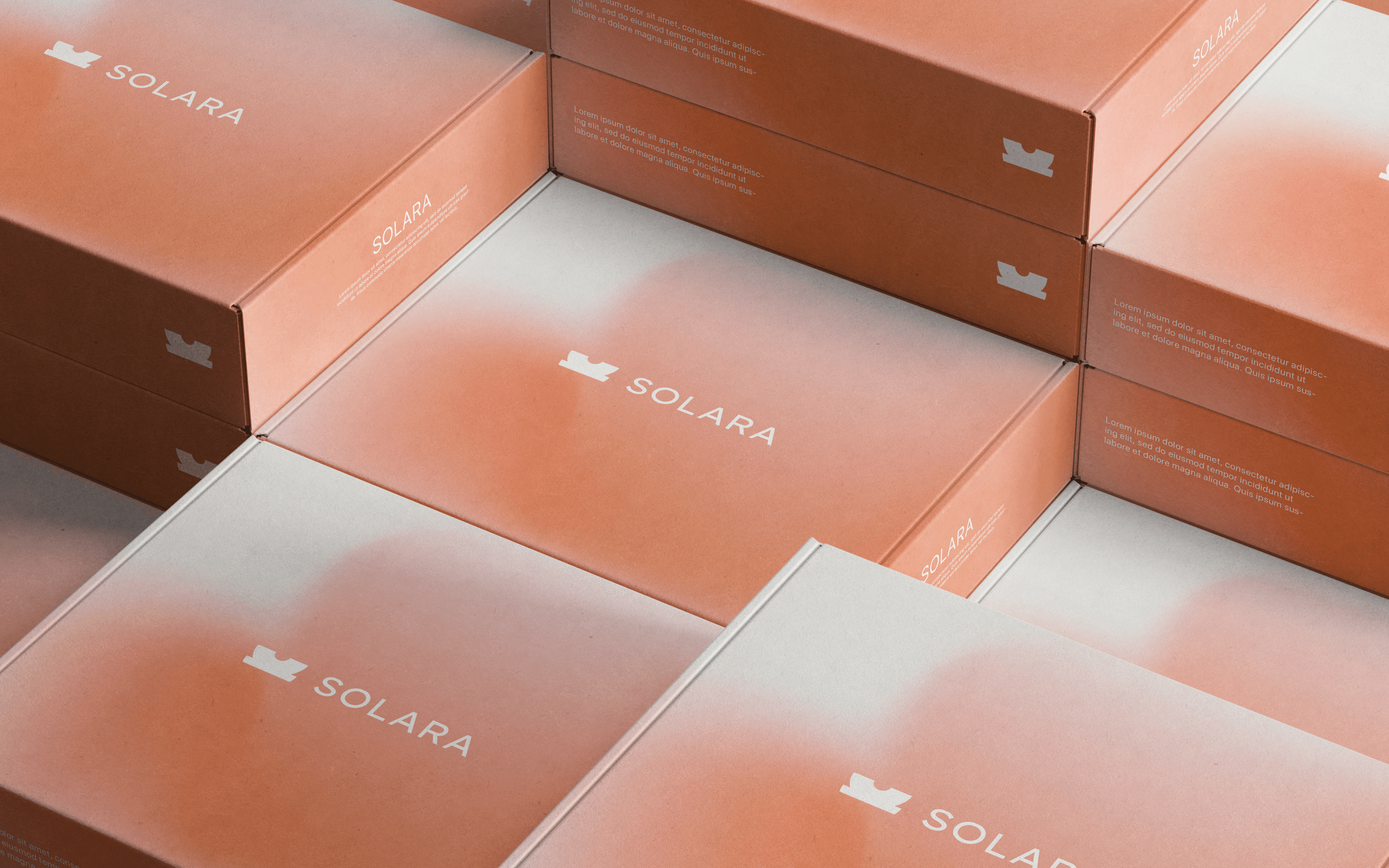
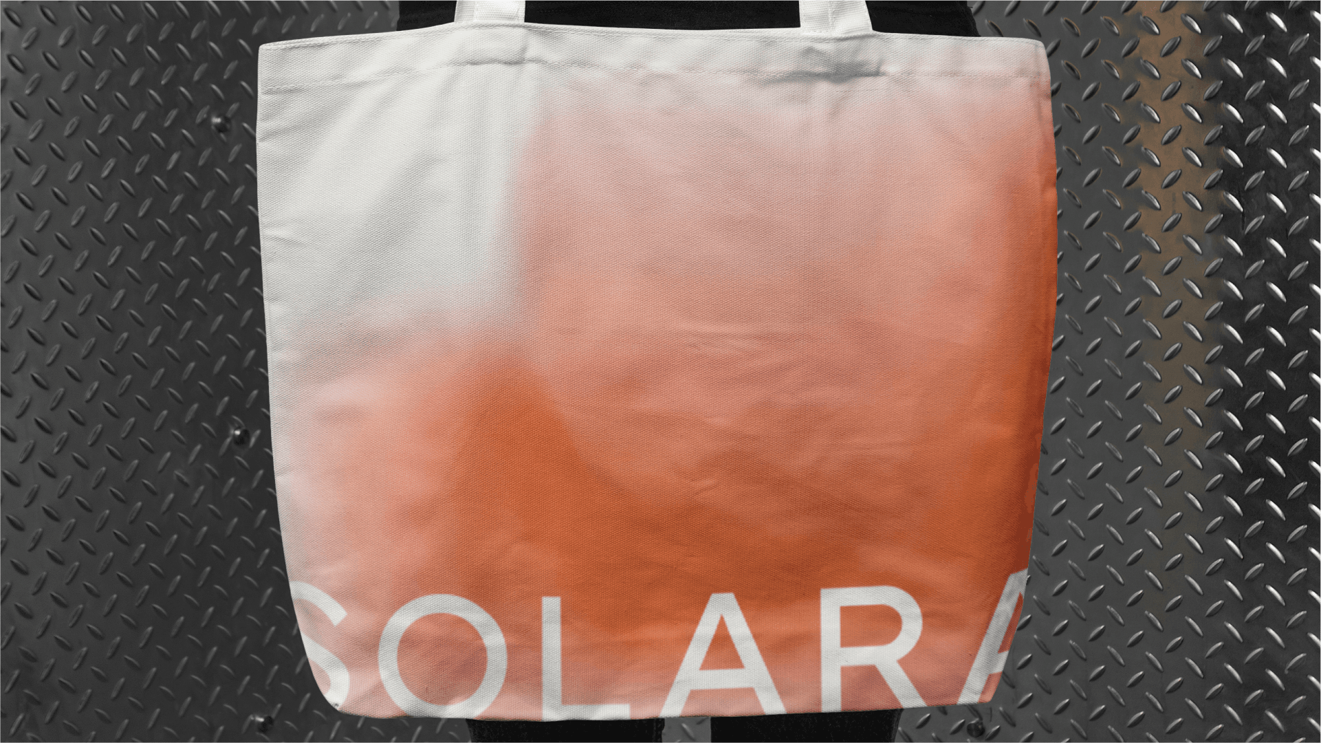
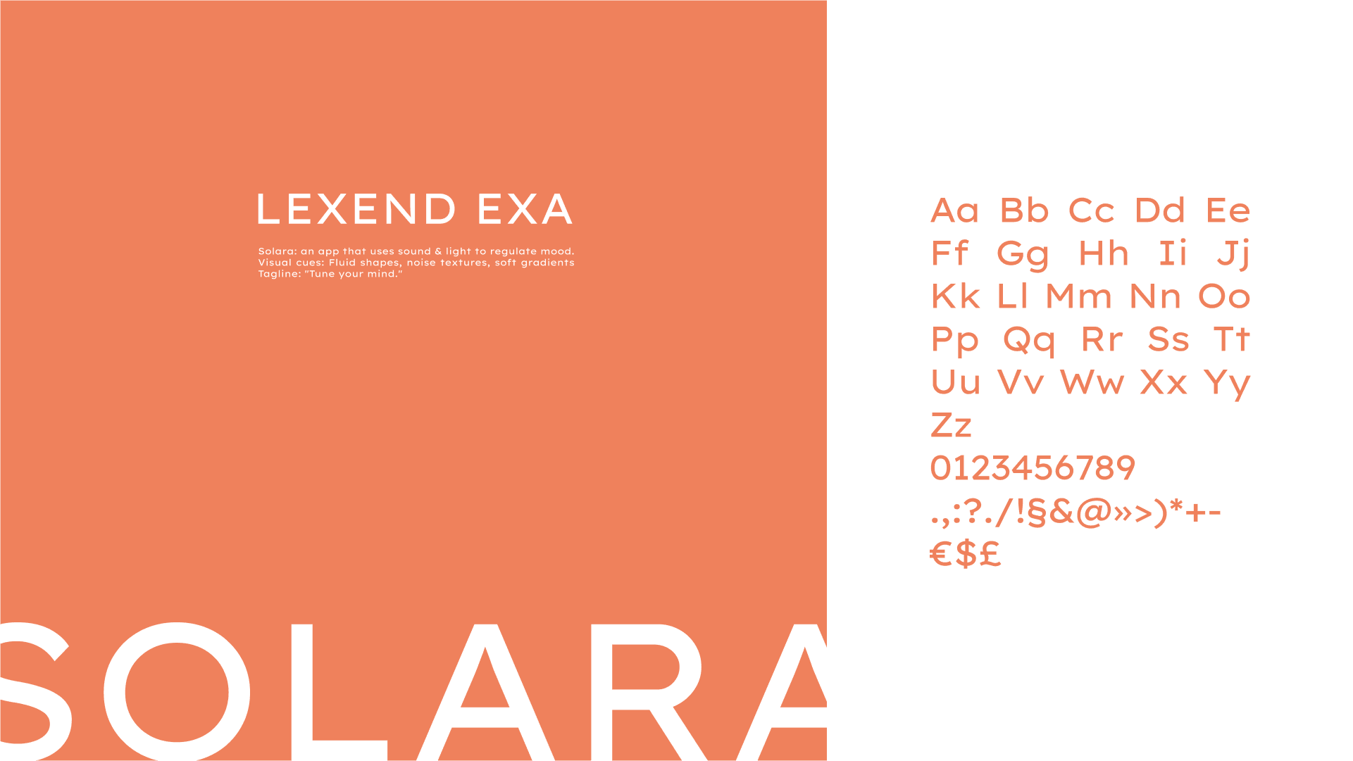
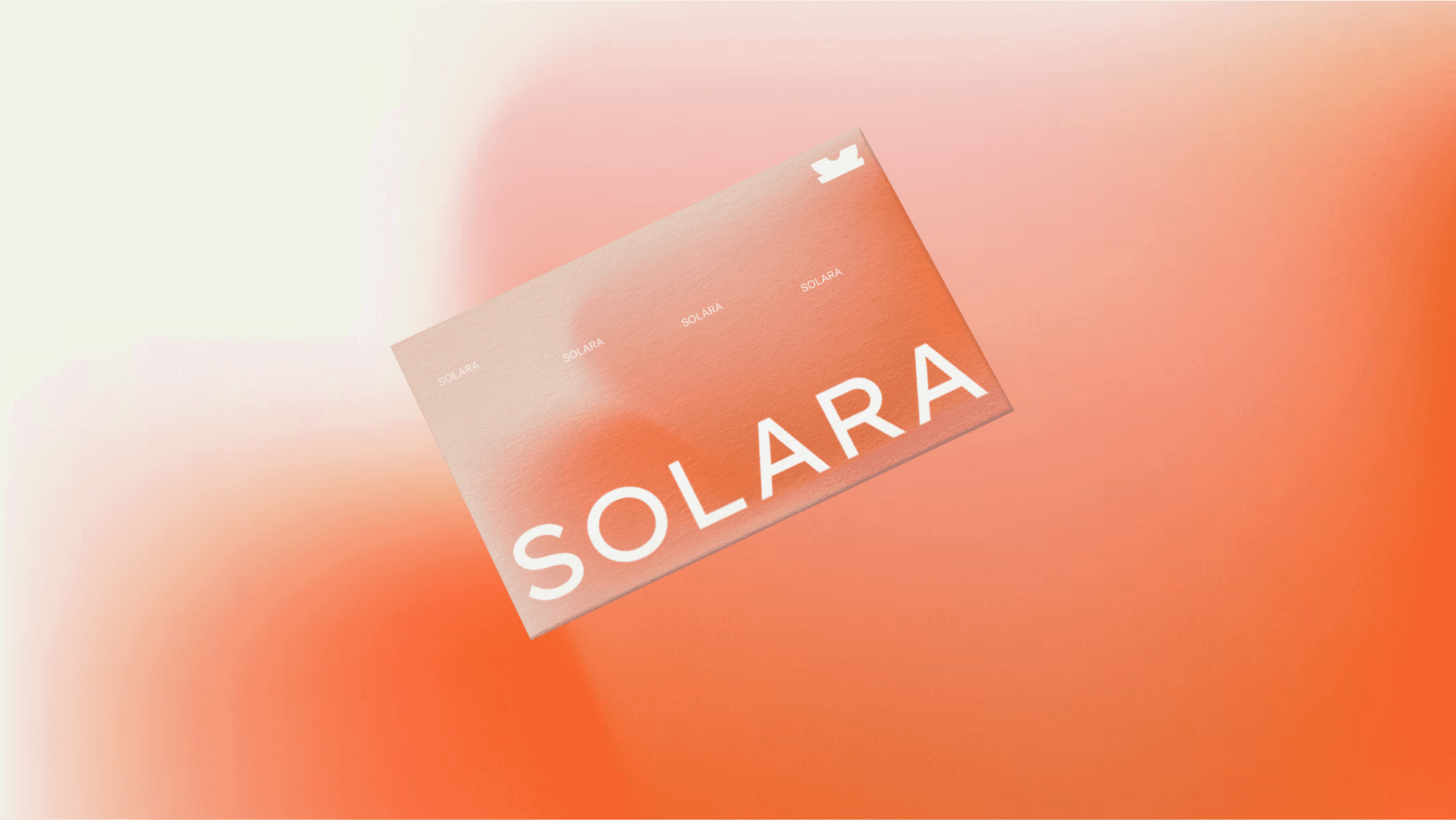
The brand identity blends fluid forms and soft gradients to echo the app’s immersive nature. The logotype is clean but slightly softened, creating a sense of warmth. A calming color palette of solar tones, orange, peach rose, mirrors the transitions of light and mood. Textures like soft noise and blurred halos evoke a sensory, almost meditative atmosphere. Together, the visual language invites the user to not just use Solara, but feel it.