ARCYON is a minimalist and modern brand created for skiers and snowboarders who demand both high-performance gear and seamless digital connectivity. It provides physical products (technical clothing and accessories) as well as an integrated mobile app for geolocation, safety, and social connection on the slopes.

Problem
The challenge was to create a brand identity that feels sharp, professional, and purpose-driven — without overloading it with visual noise. It had to reflect both the physical world of rugged snowy environments and the digital ecosystem ARCYON aims to build for its users. The identity needed to resonate with tech-savvy athletes and alpine minimalists alike.
Outcome
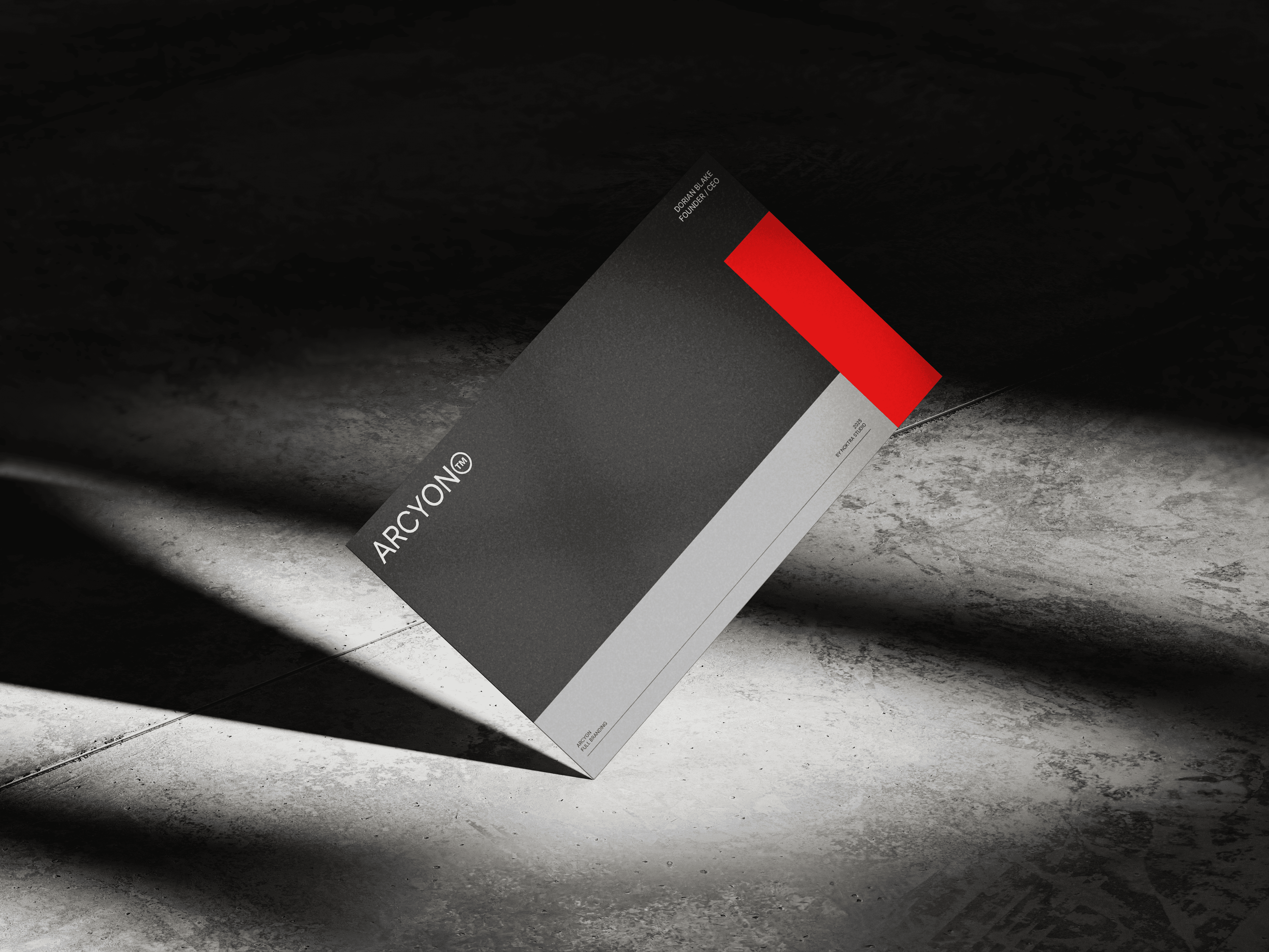
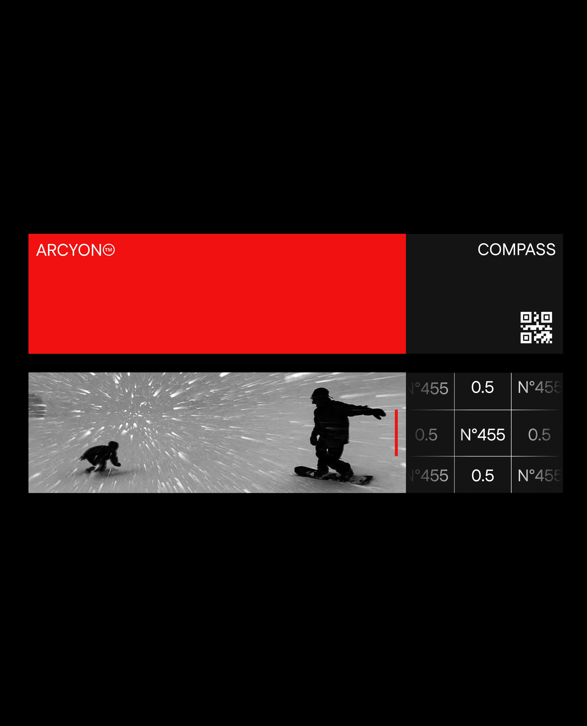
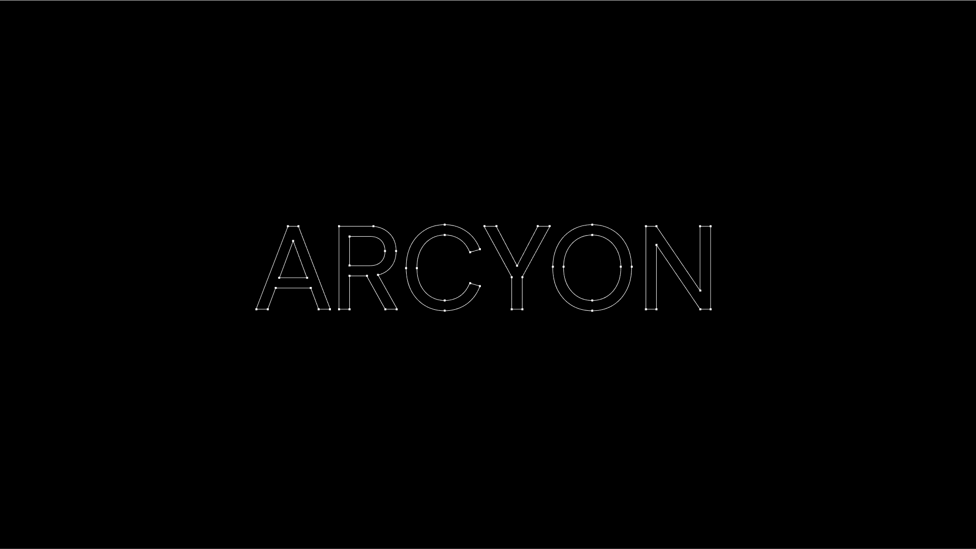
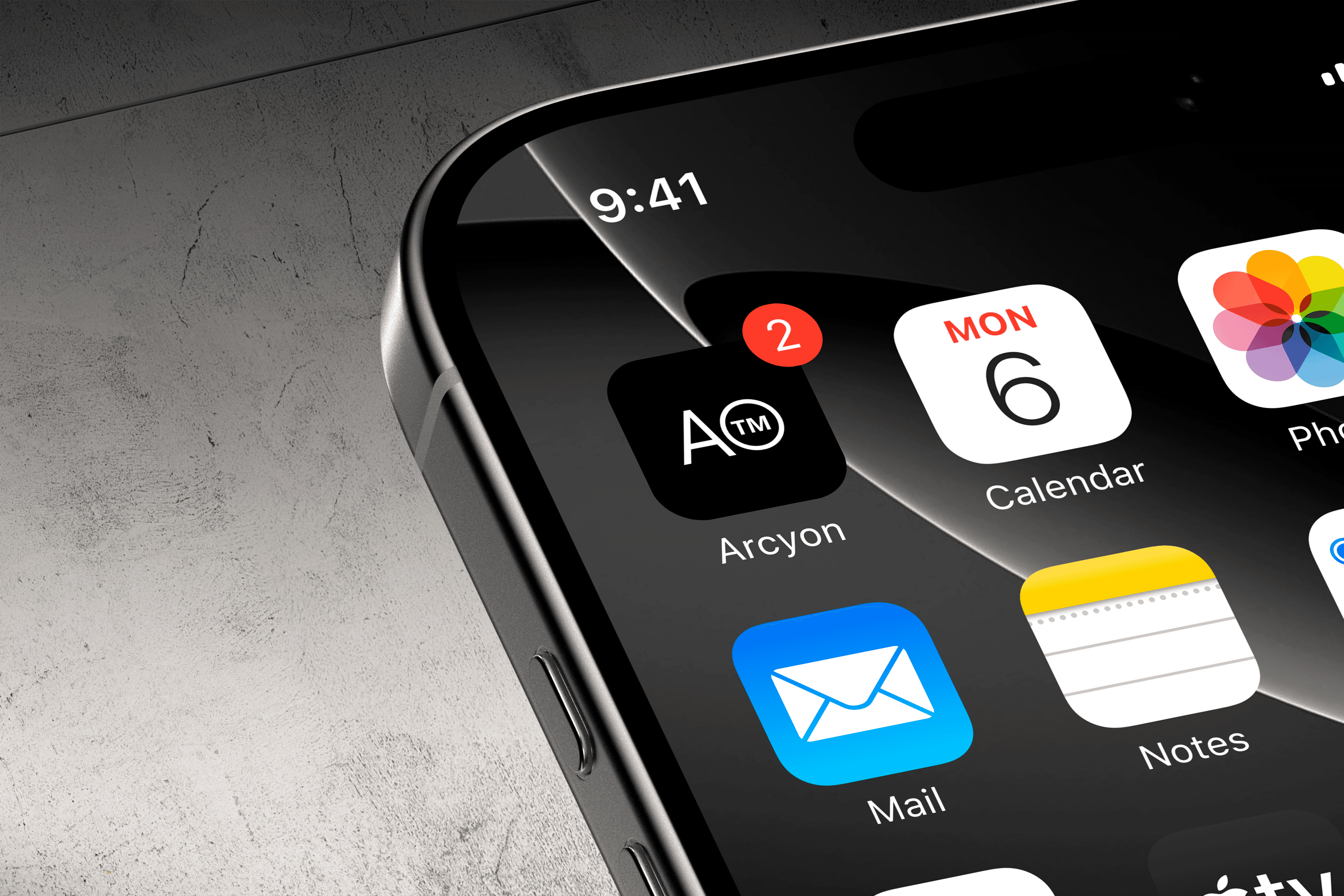
The logo is ultra-minimal: the word ARCYON in uppercase Fustat, with a circular-stroke ™ mark placed as a seamless extension of the wordmark. The typography is clean and modern, evoking clarity, precision, and elevation. The overall system is modular, with room to grow across digital and physical touchpoints — from stitched-on garment labels to in-app UI screens. The brand feels premium, focused, and ready for real terrain.